Rain Bird Central Control
SAAS/IoT - Platform unification

Displays
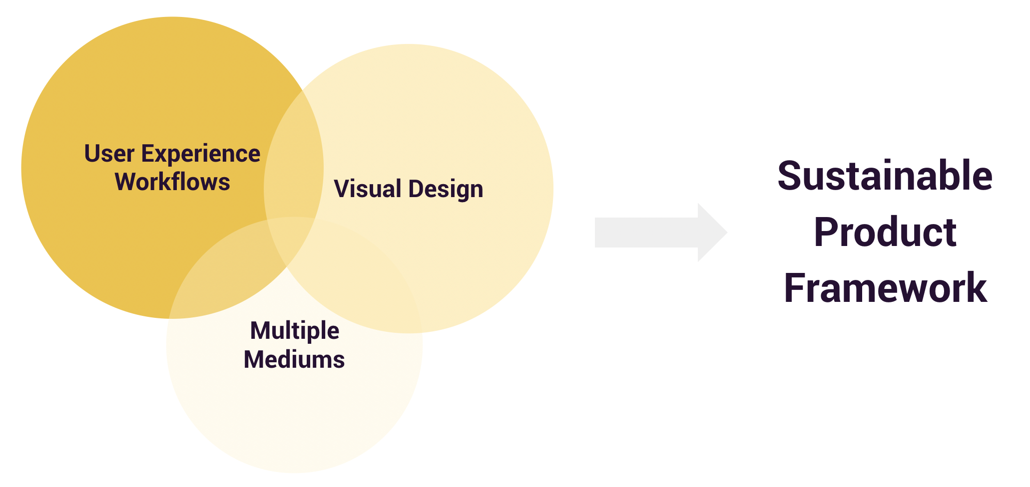
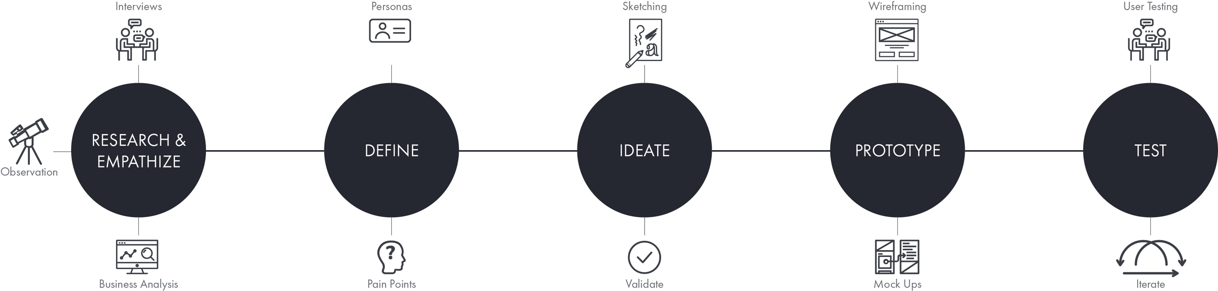
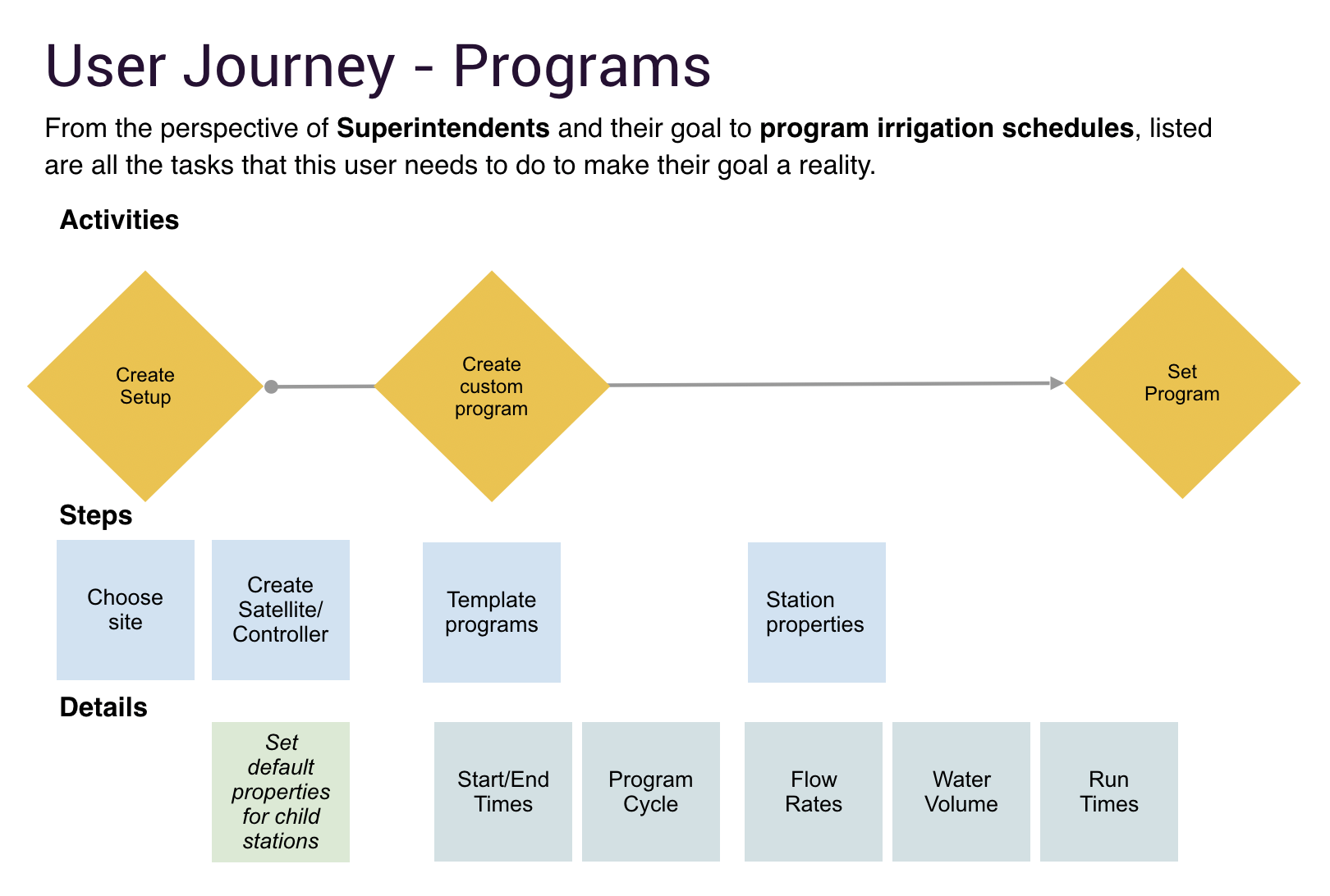
Information architecture and navigation challenges in the redesign of a complex, data-intensive, workflow-driven SAAS application.

Background

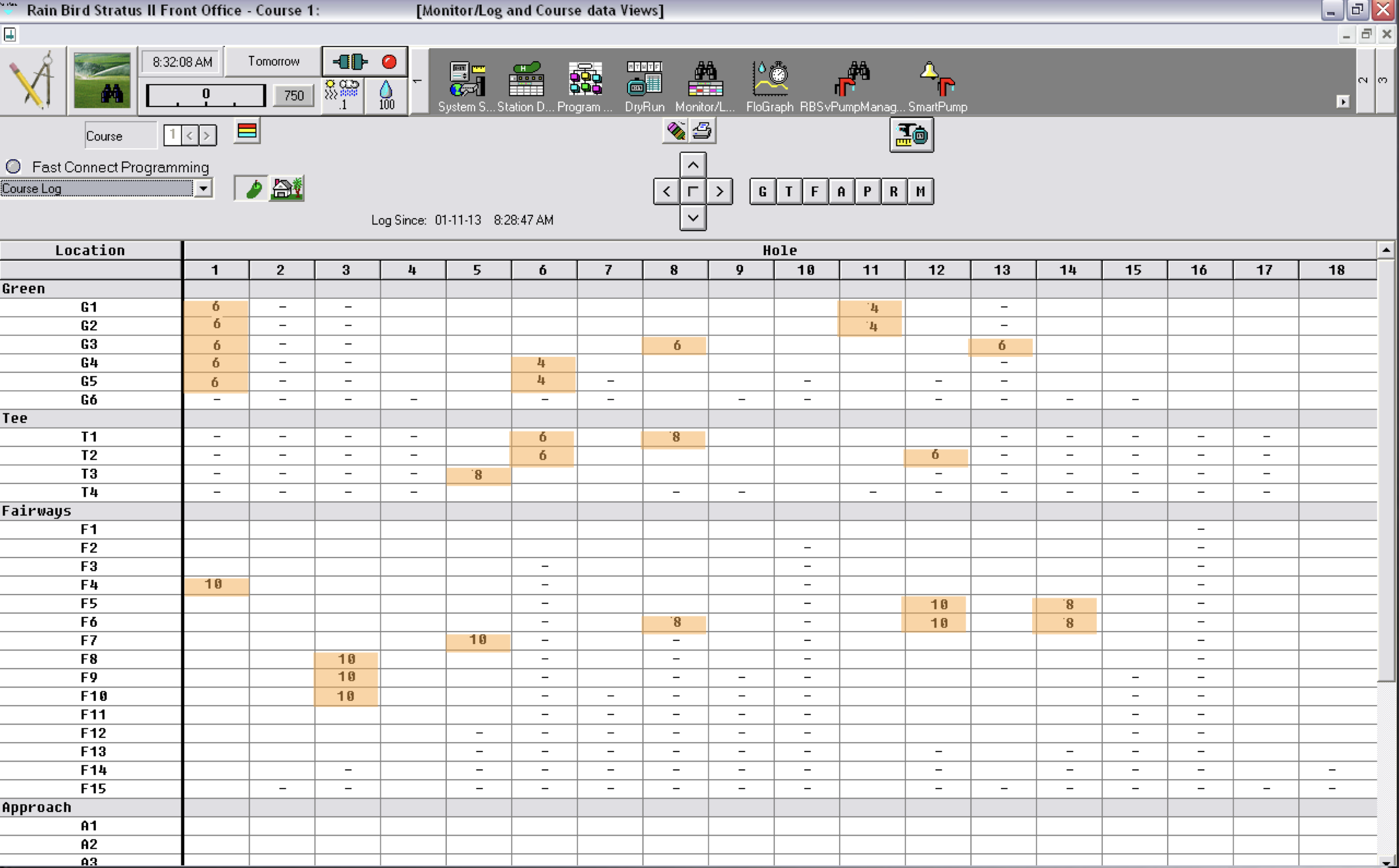
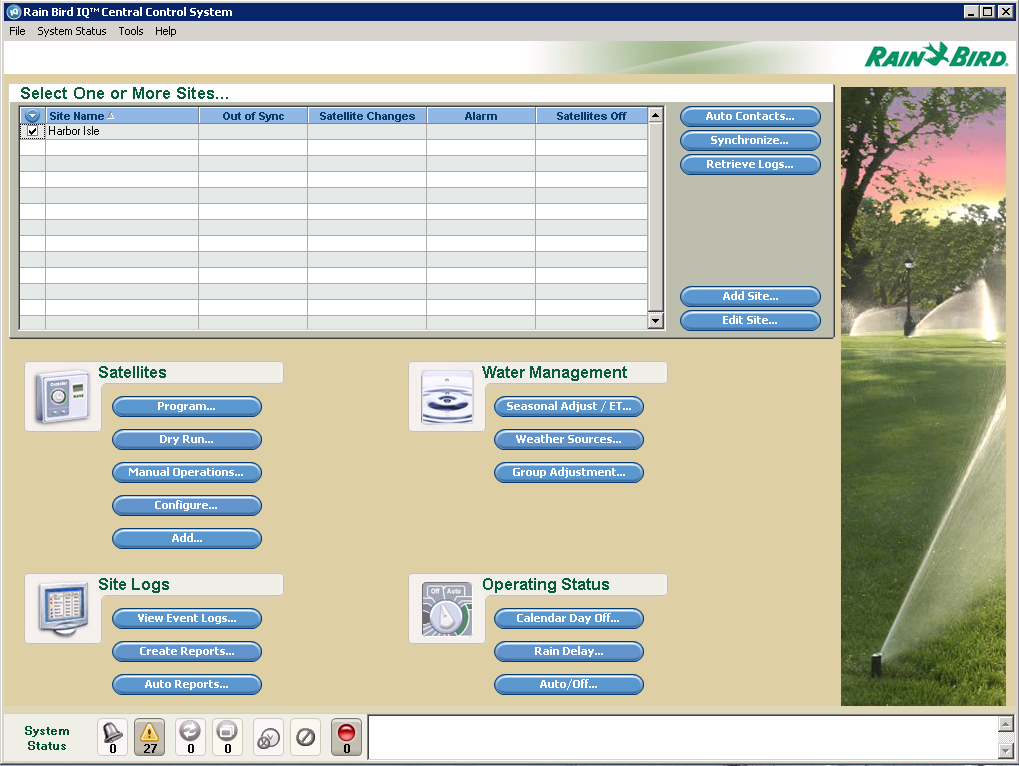
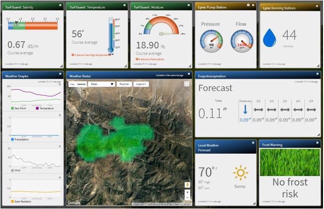
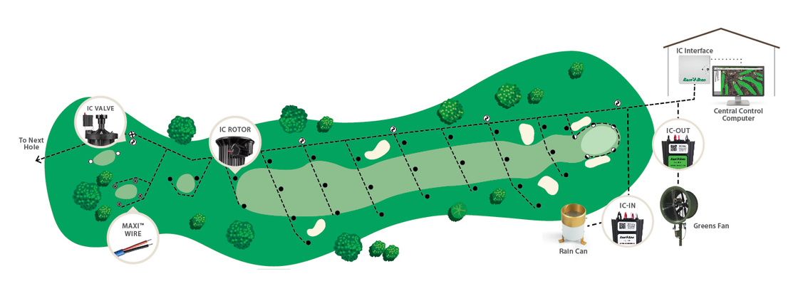
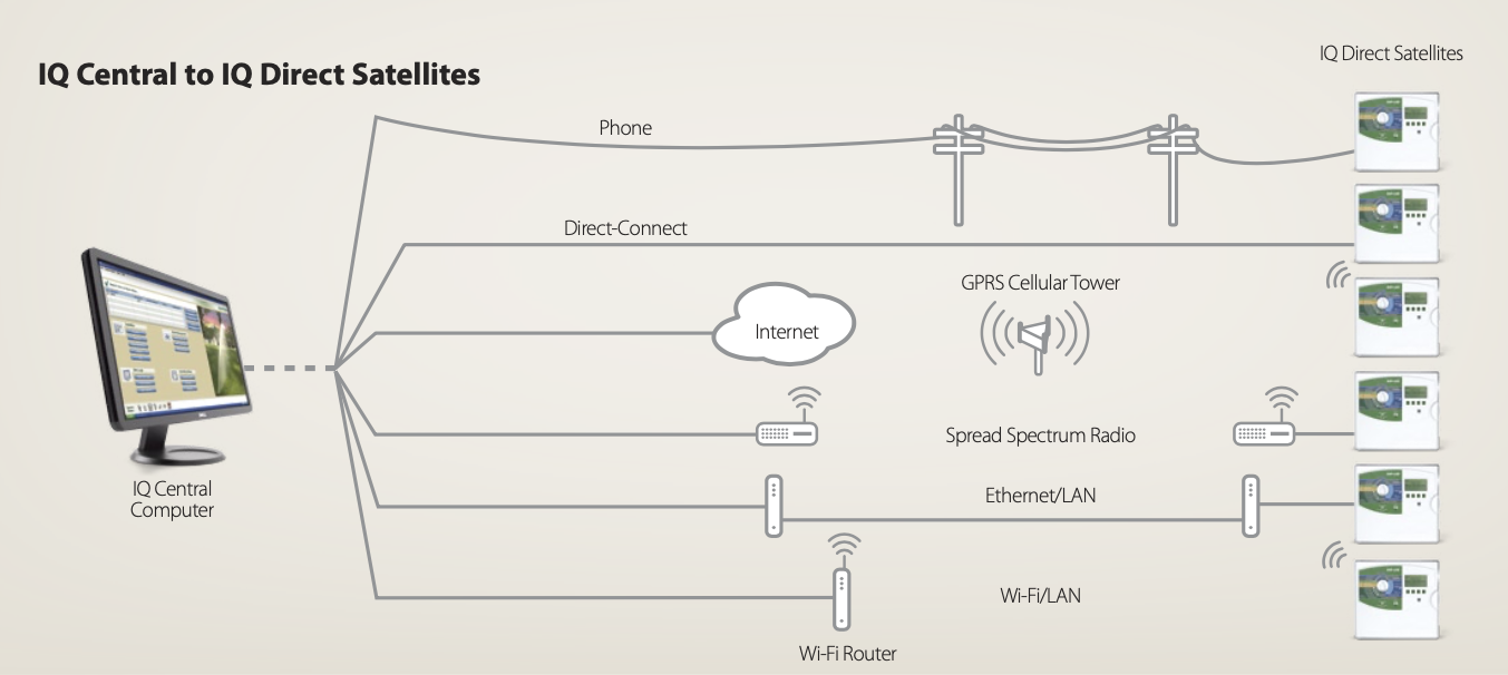
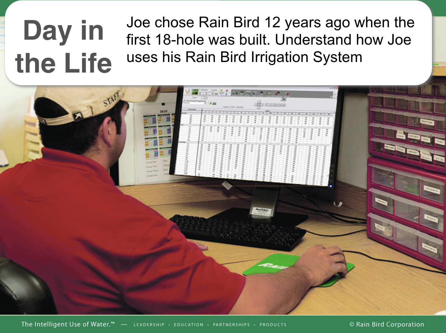
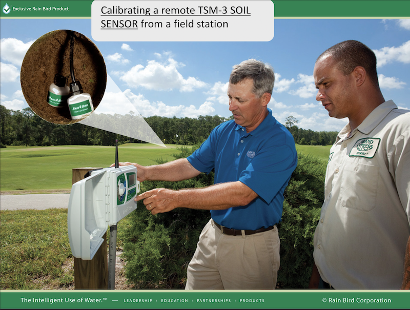
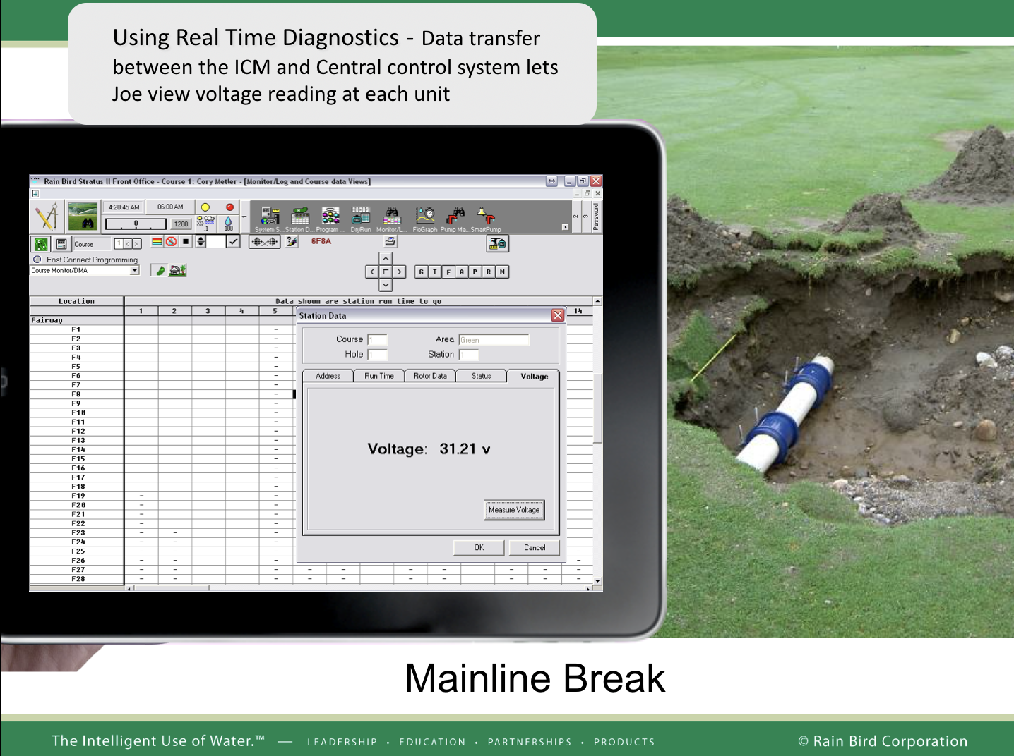
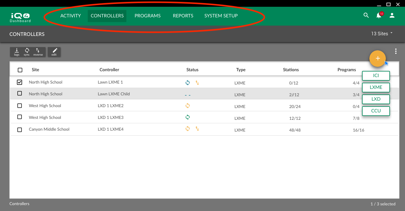
Rain Bird is the leading supplier of irrigation solutions for large commercial sites (cities, schools, theme parks, Disneyland) and golf courses (e.g. Pebble Beach). Historically, there have been two, separate, desktop applications for administering each of these domains, —IQ3™ (commercial) and Cirrus™ (golf).

pebble beach

A green being irrigated at Pebble Beach golf course. Monterey, CA. using Cirrus™

Business Drivers

For the commercial market, the prime business driver is growing new business. For the golf market, the prime business driver is preventing switching to the competition.

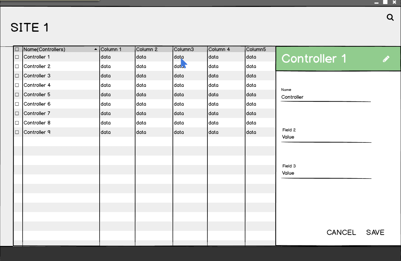
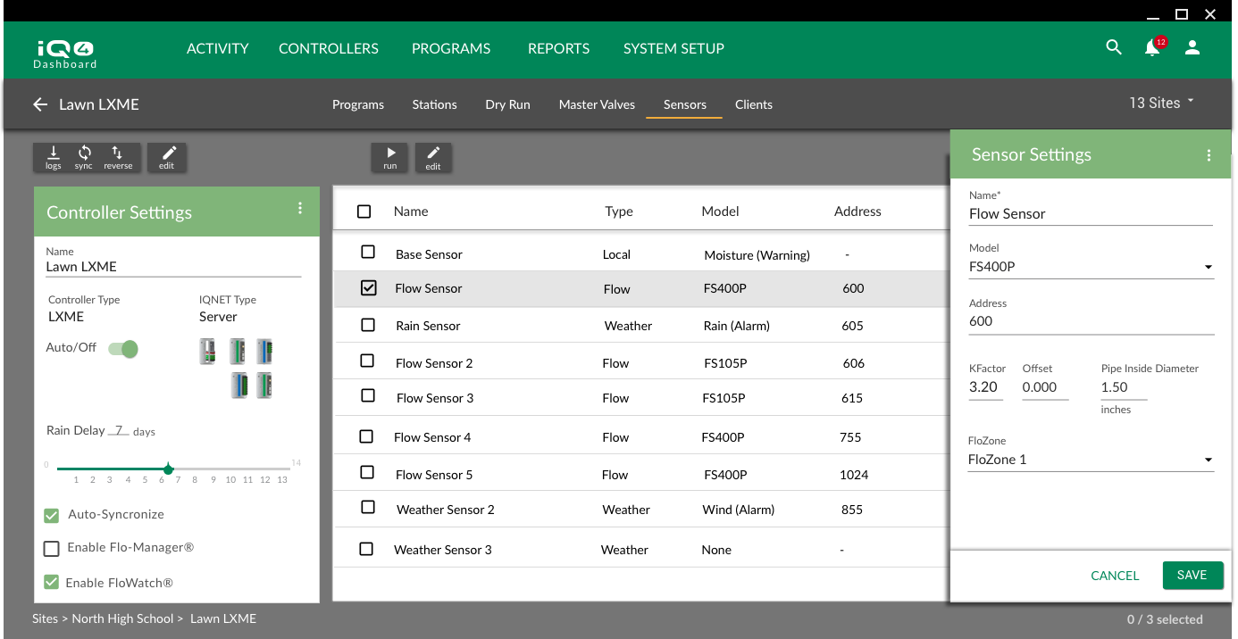
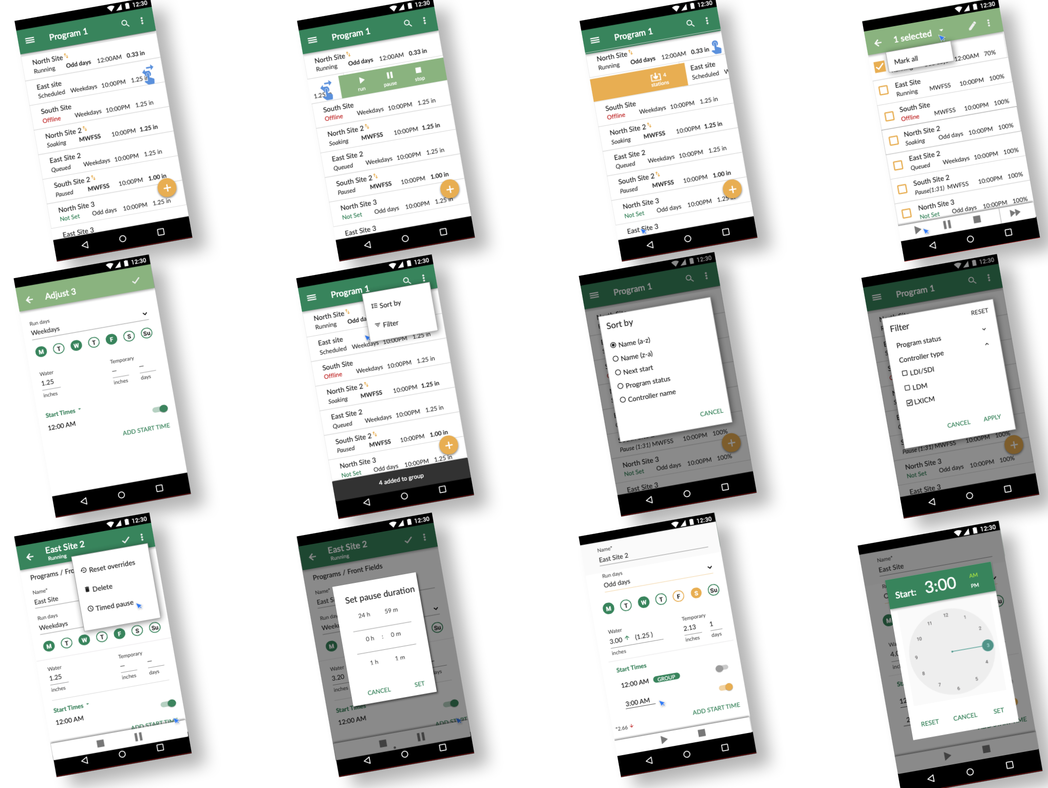
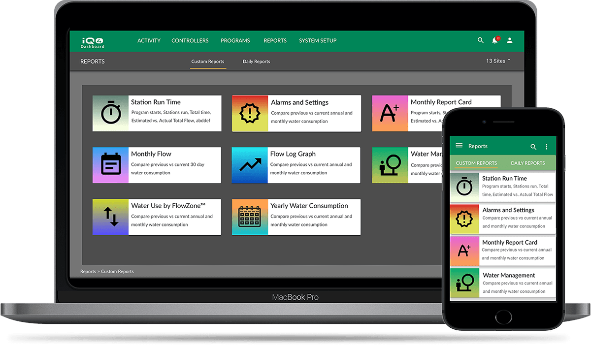
Over the years, these two legacy applications had built-up significant technical debt and with it a fragmented experience (UX debt). Old and new competitors were starting to offer better integrated features and a responsive, modern UI.

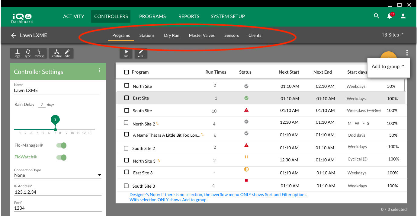
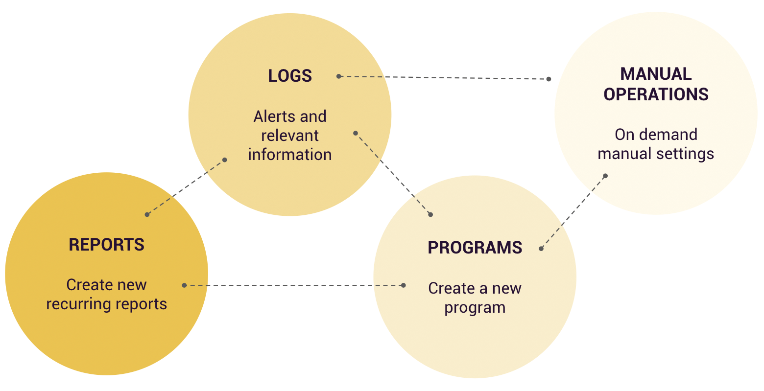
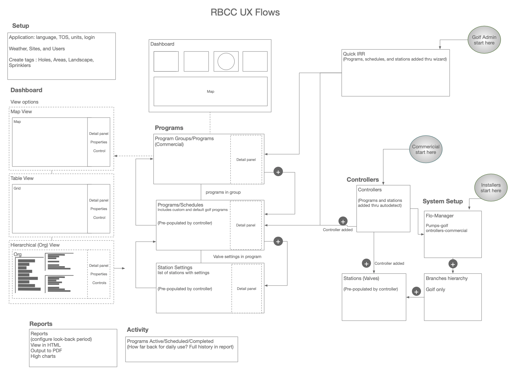
To meet these challenges, the business decided to invest in platform unification (e.g. single code base) and UX design — the Rain Bird Central Control (RBCC) project.

business value

Project kick-off goals for RBCC

Role
Product Designer
UX Activities
user research
interaction design
content inventory
information architecture
competitive evaluation
field study
personas
user journey
task flows
wireframes
prototypes
copywriting
icon library
visual design
design thinking methodology
style guide
Tools
Sketch
InVision
Adobe CS
Balsamiq
OmniGraffle
Sublime Text
MS Office
Material Design System
Jira
Slack

Challenge

I've done many redesigns over the course of my career. The biggest challenge is that the entire application and all features must be designed together. But there is also a huge opportunity to remove UX debt and restructure the product as an organic whole.

With a redesign, there is no option for MVP or iterative releases — you simply cannot leave out existing functionality.

Other challenges included: the need to merge legacy applications, rebrand, and add a large backlog of postponed new features.

Solution

I was able to design an integrated application that met project goals with unambiguous information architecture, approachable navigation, robust data filtering, and task-optimized screen layouts.

The platform unification was achieved by dynamic affordance of shared, but separately focused, features within a sustainable product framework.

Mobile functionality and improved visual appeal were other top priorities that I worked out using clean, responsive design, with a solid basis in the Material Design system.

old golf UI

Legacy Cirrus

old IQ UI

Legacy IQ3

New design

New RBCC with dynamic feature set

Approach

RB design methodology

design thinking methodology — with subtasks

Product Research

Value Proposition

I interviewed stakeholders, which yielded primary business goals:

#1
Modern Responsive UI

Modern, scalable user interface that is optimized for any device.

#2
Streamlined Navigation

Affords easy set-up of controllers, stations, programs, areas, and sensors — with quick batch editing.

#3
Tiered User Access

Multiple layers of permissions for configuring the system as well as performing remote operations.

Competitive Evaluation

Competitive evaluation against Rain Bird’s top competitors found these high-level differentiators:

competitor UI

Toro Lynx sports a feature rich dashboard

competitor UI

Newcomer Rachio with a clean, modern UI on mobile

old golf UI

Rain Bird IQ, unmatched in features, but lacking ease of use and visual appeal.

Feature List

I tore down the IQ3 and Cirrus applications and compiled a content inventory of every feature and function. Now I could start thinking about how to put it all back together.

feature list

Feature list for the UI—one of 3 pages

Internet of Things — Hardware and Logistics

To truly understand the complexity of the physical system required many long, deep dive sessions with experts about how an irrigation system is setup and configured. There were some things I needed to go over 3 times to confirm the concepts.

I found it extremely challenging (and fun!) to learn about the many overlapping layers in the system : controllers, wired/wireless network grid; pumps (golf) and pipes; stations supplying different sprinkler types; programs grouped into schedules; holes broken down into areas (golf); and a wide variety of sensors — all interacting with each other.

golf color schematic

Golf hardware schematic showing many components of a system

commericial network

Wiring controllers (1 of 4 types) physically to the system. After installation, each connection needs to be entered as data in the system

Lessons Learned

In the beginning, I was taking notes during domain drilldown sessions. But that way of doing it lost the connection between things.

I became more accurate and efficient when I started using the whiteboard to map things out and then took screenshots to remind me of details.

whiteboard

Whiteboard working out hierarchy of golf station runtimes in a sub-area, within an area of a "hole" connected to an ICI controller

User Research

Design Workshop

I gathered internal admins, the product owner, and sales reps to learn about users, and conducted an exercise to establish primary user roles.

post-its on whiteboard

User definition and voting exercise

Field Study

A conducted a field study, a the day in the life, of a golf superintendent, to understand his daily tasks and the context of use of his irritation central control system.

Later, I used Joe as a primary persona.

water manager

Golf course manager, Joe

checking soil sensor

Checking a remote soil moisture sensor

mainline break

Diagnosing a mainline break

User Research Summary

These were top job concerns of Water Managers:

  1. water-cost savings
  2. an increasing awareness of the need for water conservation
  3. integration of sensors (soil moisture, rain, weather, wind) to automatically adjust water use.

In an irrigation central control application, users look for efficiency of workflow, flexibility of controls, and proactive visibility of the system status .

I produced and validated this concept diagram of our users' mental model that addresses their job concerns in the application.

mental model

Mental model of the critical paths in the application that satisfy the primary goals of users

Personas

Commercial Water Manager

Julie

BACKGROUND
Julie Prima is the Grounds Manager at the Persnickety HOA in San Marcos, CA. She’s been with the company for 3 years year and is responsible for maintaining the common areas along roads and 2 parks. She has three direct reports. The old irrigation system is in need of replacement and she is shopping for a new one. She is looking for a system that features a Controller program that will let her program and run her stations centrally. She isn’t very technical: MS Office and email is about where her level of comfort is with computer applications.

    GOALS
  • Wants a self-managing irrigation system, to free-up her time for other things.
  • The fewer complaints about the property, the happier her day.
  • Show my value and ROI to stakeholders
    
PAIN POINTS
  • Not easy to create the custom reports for what I want to show stakeholders
  • Cannot delegate manual operations to on-site maintenance workers.
  • I know they are important, but not clear how to respond to notifications.
    KEY CHARACTERISTICS
  • Spends 2 days/week out in the field. Other times, coordinates with an on-site maintenance workers.
  • Gets frustrated when things aren’t clear
  • Leans on support resources to help.

QUOTABLE QUOTES

“Water is becoming more critical, and we need to reduce costs”
“I get these alerts sent to me… and I don’t have it shutting the system down, because I don’t trust it yet”

Golf Superintendent

Joe golf superintendent

BACKGROUND
Joe Walters is the Superintendent at the Peninsula Golf Course in Orlando, Fl. He’s been with the company for 6 years and is responsible for maintaining the grounds, including watering the courses. He has 5 direct reports. The watering schedule is the most important aspect of Rich’s job. He knows he needs to configure the watering schedule at more granular level, but it is difficult to immediately see what the state of the system is by looking at the screens of the current application he is using. He finds many of the features of the current application confusing. Rich would like to train someone else to help him, but the current Controller Manager isn’t very intuitive.

    GOALS
  • Save water costs and time by optimizing the water use.
  • Know at a glance what needs doing, what has been done, and the effects.
  • Progress towards being able to delegate water management tasks.
  • Manual control of programs, stations while inspecting the course.
    
PAIN POINTS
  • Relying on memory as to needs attention and what was done before.
  • Cannot run manual operations while I am at the point of need.
  • I need access to meaningful information so that I can know how to act.
    SCENARIOS
  • AM: Checking rainfall, checking for zeroes, checking course logs
  • Responding to notifications and alerts
  • Inspecting the course, running manual operations.

QUOTABLE QUOTES

“It’s hard to get a big picture of what you’re running that night through the current UI.”
“People make an adjustment… and they’re not aware of how wide-ranging that adjustment is… you have to go back and figure out where the adjustment originated.”

System Installer

Avatar placeholder

Missed this ad hoc persona

BACKGROUND
This persona does all of the initial setup and connectivity for the system. They input the pumps and flow meters, connect the stations to the controllers, set the sprinkler types, define the default site and admin, and set up initial areas and program schedules.

Lessons Learned

No photo because I missed this one when creating ad hoc personas. I caught it as a result of a card sort exercise that, fortunately, included an installer.

This meant redoing the information architecture. Then I foregrounded installer tasks in a dedicated System Setup area for jobs this user does.

Just because a user isn't in the majority don't assume that their job and the features in the application to support them aren't critical.

User Journey

Defining the user journey is the key activity in the user research phase. It brings together business value, user goals, suggests the content and controls, and charts the course for information architecture.

user journey programs

User journey for a golf superintendent to setup an irrigation schedule

Information Architecture

My father was an architect. I knew from an early age that architects interview clients to gather requirements, then they draw blueprints (centimeter-perfect), and sometimes they color up a few comps for exteriors. Contractors manage a team of general and specialized construction workers who build the project. Painters and interior designers add visual appeal according to current trends. It’s a near exact analogue of a software product team.

blueprint

Architectural wireframe used by a contractor to develop a house

Taxonomy

After sorting through the feature inventory, I devised a hierarchical taxonomy to address the primary tasks of our personas. I incorporated the 1st-level categories into the top nav. The 2nd-level in each category became tabs. Changes to label text accounted for terminology differences between Commercial and Golf.

commerical controller list

1st-level categories in the Top Nav

commerical controller settings

Dynamic, 2nd-level categories shown as tabs

Data Presentation

RBCC is a data-intensive app. There are hundreds of fields and thousands of records in the database. I can always tell when a back-end developer has done the “design” because it is usually a database dump into a grid. That was the case with Rain Bird’s legacy apps (see below).

A database-intensive screen can be overwhelming and unusable when not in context of the job to be done.

old golf UI

Data dump into a grid. Every and nothing

Prioritizing Data — Card Sort

Careful not to remove a familiar view, I retained data grids in the new UI. But to be usable, the key is prioritization.

I reached out to several end-users who fit the profiles of our different personas. They were given a list of fields to rank by most important station properties.

The question I wanted answered was, "Of 34 possible fields, what are the 10 most important to surface in the data grid?"

priority card sort

User responses color-coded and ranked by average (median).

Site flow map

There was reasonably close agreement among all participants of the study — all but one (the 2nd column). It turned out he was the only System Installer of the group. His ranking was nearly a reverse set of the others.

Because of this study, I changed the design to include a separate Systems Setup area and flow for installers.

sitemap

Site map showing high level UX flows, by primary persona

Lessons Learned

I didn't have enough users to ensure sufficient data points to achieve a reliable confidence level in the card sort. These results will need to be tested again with more users.

Interaction Design

RBCC data is both broad and deep requiring navigation up-and-down parent-child hierarchies as well as transiting across categories.

Page Layout - Inefficient Horizontal Space

Before I came on, Rain Bird had received some initial designs from an agency consisting of a mood board, a few page templates, and navigation.

They featured a pattern that is common in many enterprise applications: a left-side nav that can be minimized to icons. Three problems with this:

  1. Icons aren’t usable. This was reinforced when the lead dev, who had been working with it for a few months, still couldn’t remember which icon was which without opening the panel.
  2. Loss of horizontal real estate in an application where data grids with many columns are a central feature.
  3. It is often a failure of information architecture to simply list every feature in a long column. Here, there weren’t even that many.

agency template nav

Agency wireframes— Side Nav open

Page Layout - Inefficient use of Vertical Space

The agency designs had also reserved an inordinate of empty real estate in the title area, a recent trend in marketing websites.

With screens often displaying hundreds of rows in a scrolling grid, again, you afford the loss of vertical real estate.

agency template icons

Agency wireframes — Side Nav minimized. Wasted space in page title area.

New Page Layout - optimized for Data

My solution was to move primary nav to the top. This optimized horizontal space, making more available for data. Also, the menu was now permanently visibile. Even with the addition of a tab bar and a toolbar, the new design still used less vertical space!

The stakeholders and team had all wondered about that and cheered when I closed it up.

Nearly 25% more data was now visible on our target desktop devices.

new layout

New design — with Top Nav

Design for Data

As with many data-intensive applications, RBCC required core screen templates for displaying a data grid and a record with full details for item from the grid. Unique to RBCC, users needed to navigating up and down the parent-child hierarchies as well as transiting across categories at the same level.

1st Concept

The agency’s design for viewing a hierarchical item on desktop was to show a left-side panel positioned to the left of a grid of its children. Selecting a child item from the grid would drilldown to its details screen.

This design was rejected by users because to do set properties for this child item, they needed concurrent visibility of the siblings' values from the grid. It was one level too deep.

first concept

Agency design — parent detail (left) with grid of children

2nd Concept

I proposed flipping the interaction around where drilling-down in the grid would display the child details record in a slide-out panel to the right of a grid of its siblings.

Solved one problem, but it resulted in the converse problem not being able to see the settings of the parent, which users often needed to know. Still one level too deep.

second concept

New design — child detail (right) with grid of siblings

3rd Time's a Charm — Final Design

The next design merged the first two into an innovative UI featuring a left parent panel, a center grid of its children, and a right slide-out panel for the child details. The parent’s settings and the child's are both editable in this view, while being able to see important settings for each sibling.

final design

High-res iteration — of interaction design with the best usability for tasks within hierarchies

Responsive Design

Another win for this design was speed of development. This design lent itself seamlessly to responsive development. The side-panels were easily sized to the width of a mobile phone.

I created this prototype in Sketch for developers to understand how the interaction design of the parent and child side panels works on mobile.

From list to item details to its children and back

Dynamic screens

Most of the screen designs were templates for dynamic content. This meant I had to constantly be aware of the expected string length of populated values.

Not only that, but due to an international market , I needed to account for different lengths in translations (German is typically 30% longer, for example.)

translations

Differences in translated string length

I produced hundreds of high resolution, pixel perfect, wireframes in Sketch by extensive use of Sketch symbols. The micro-interactions for many of these features would warrant their own use cases to describe how they were created and vetted.

many screens

Hundreds of screens produced quickly

Conclusion

This Use Case study highlights only one aspect of the my work on the complexities of redesign for Rain Bird Central Control, focusing on the information architecture and navigation challenges of the redesign.

Other key achievements were design for a dashboard, user configuration and design of a dozen reports, simulating a daily run of the system, the icon system, logo design, and hundreds of micro-interactions.

Demo

The final design was a huge breakthrough. Everyone loved it. The side panel pattern became a signature feature, used in every area across the application.

The official YouTube video (5 min), demonstrates how to move around the application using the top nav, tabs, grids and side panels to quickly setup a new irrigation system.

If not visible, visit YouTube to watch.

Note the ease with which the user freely traverses up, down, and across the hierarchy to configure items in the system.

Next →