Cassida Daily Cash Prep
Cash Counting Machines Interface

Displays
Getting Product UI/UX done for a workflow-intensive application — on a short deadline.

Background

Cassida Corporation is a global leader in cash automation solutions. Cassida’s line includes business-grade bill counters and coin counters/sorters. Every day, large retailers, with many cash registers, must count and reconcile the amount of cash in the registers, the change drawer, and the safe, and then stock them for the next shift. The task is called Daily Prep.
pebble beach

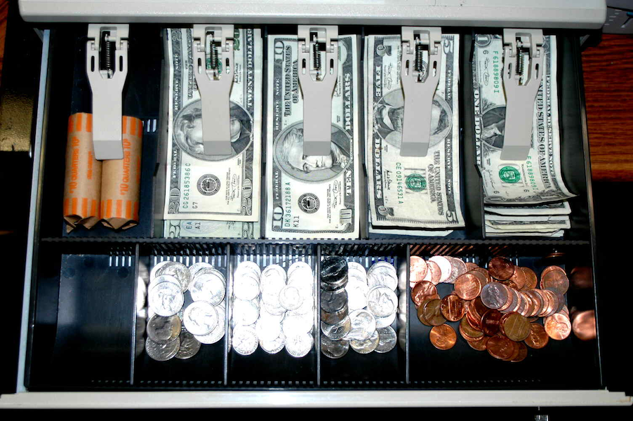
A cash register till prepped for start of shift

Business Driver

Cassida reached out to me in crisis mode. They had 6 weeks, worth millions, to win a contract from a leading retail discounter. Advantage: they were less than half the price of their competitor, so the client preferred them. Problem: It took 10 times longer for staff to do the job because Cassida’s their banknote and coin machines are stand-alone products, whereas their competitor offered a combined solution.

To meet this challenge, the business decided to hack the machines in order to “virtually combine them.” The 2 print feeds would be output to a digital file. A display, a touch-UI interface (a Raspberry Pi tablet) would allow the user to view the output. It would also replace the need to interact with the hardware controls and LED on the machines.
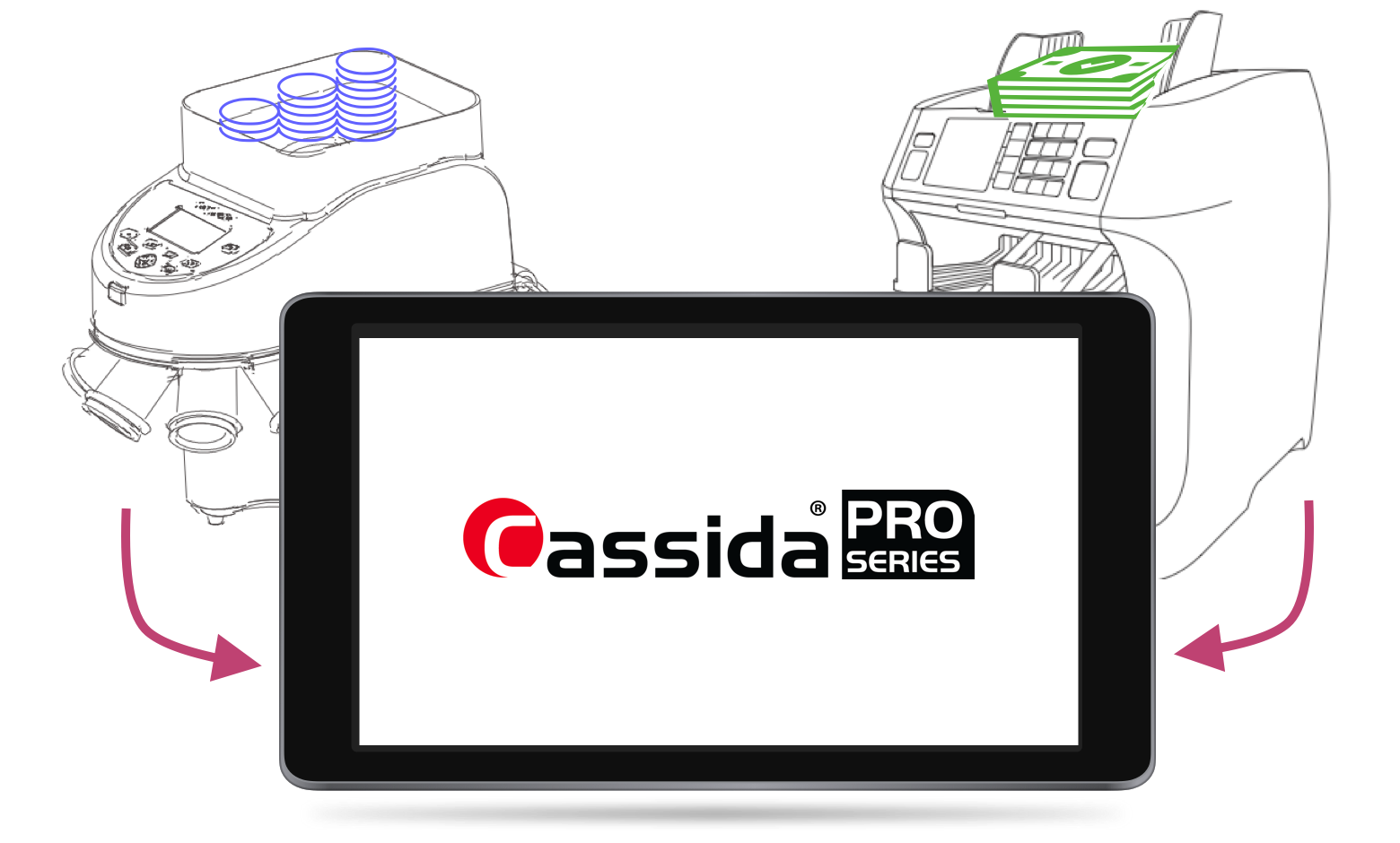
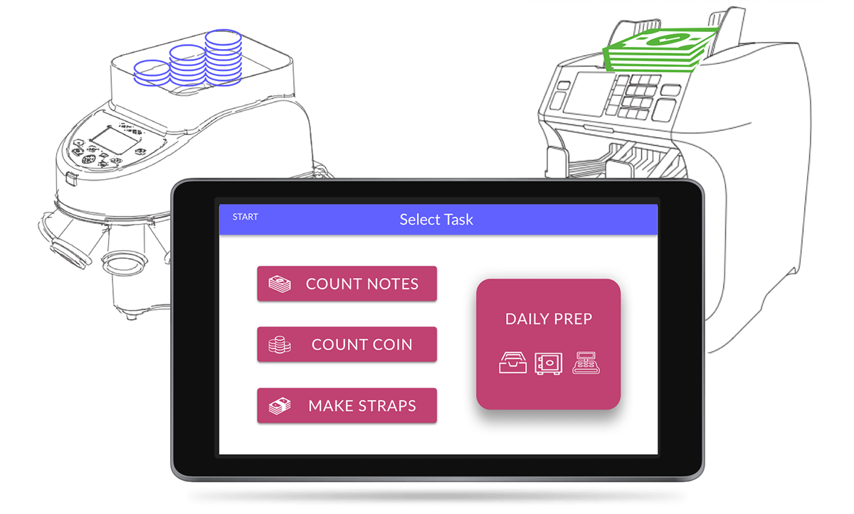
hacked machines

Goal: readout and control of banknote and coin counting machines connected to a tablet

Role
Product Designer
UI Developer
UX Activities
user research
interaction design
information architecture
competitive evaluation
field study
user journey
wireframes
prototype
visual design
front-end code
design thinking methodology
style guide
Tools
Sketch
InVision
Adobe CS
Balsamiq
BBEdit
MS Office
Material Design System
Jira
Slack

Challenge

I was being asked, within a very short window, to do product and UX research, application design, and code the UI — all in time for the developer to get his work done. From past experience, I was very concerned that with the time and resources fixed, that “good” would be a risk.

goodfastcheap

Within cost and time limits, the pressure was on, to make it good

Solution

The Team
1 electrical engineer to build interfaces to the machines,
1 developer to program commands to the machines and receive status and data back
1 UX/UI designer (me) to create the UI that would present the workflow and display the controls and data

Fortunately, each of the three members of the team were seasoned veterans at their job. A team of three meant that we could be quick and nimble. Working side-by-side, communication was immediate. We could turn on a dime.

With the right expertise and careful attention to core UX, the team was able to deliver on time

The key to speed for UI/UX

Lean UX

Engage only the critical core of UX activities — no more no less. Design is the documentation.

UI patterns

Deep repertoire of UI patterns from previous experience — in both design and code

Design System

Leveraging an established design system (Material Design)

Approach

cassida design methodology

Design thinking methodology — with subtasks

Product Research

Value Proposition

Interviews with stakeholders about business value along with demos of the machines, resulted in these value propositions:

Cheaper - Lower Price Point

The application uses open source assets. Cassida's machines already cost much less.

Better - Modern UI with Workflow

The UX is modern and attractive and guides inexperienced users through the workflow, it is:delightful, decreases time on task, and reduces training time.

Faster - The coup de grâce

The Cassida solution is faster than the competition's. The built-in workflow in the UX optimizes efficiency.

Competitive Evaluation

This step was straight-forward. We knew who the competition was. Moreover, the client invited us on-site to observe the competitor’s machines during their daily prep. I was able me to do both the competitive and user research during a single field trip.

The competitor’s product was nearly identical in functionality: two separate machines with separate LEDs and keypads on each one. The difference was that the combined output for their two devices fed into a single receipt printer.

competion in action

Field trip: observing the client using the competitor's solution

User Research

Field Study

The client invited us on site to take notes and a video of the Daily Prep process on the competitor’s machines. A caveat to keep in mind, was that user was highly skilled, which we learned was not typical.

    The major work of Daily Prep includes:
  1. Physically manipulating the currency: moving it from bags to the machine, to the table, and back to bags.
  2. Interacting with the machines to configure them for what to do next — tabulate, batch, sort, etc.
  3. Reading the printed receipts and entering the results into financial software on a nearby PC.

Manually entering coin roll counts into the coin machine

Opportunities

During the field study, in addition to documenting the process, I identified three major opportunities.

Opportunity 1
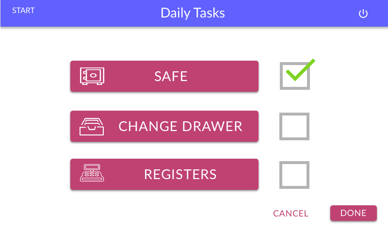
Build in workflow to make the process clear. The user had to configure the competitor's machine for each operation. With the Cassida app, the user would simply tap a Menu item, or tap Enter or Done to move on to the next step.

workflow

Workflow in the Cassida app

Opportunity 2
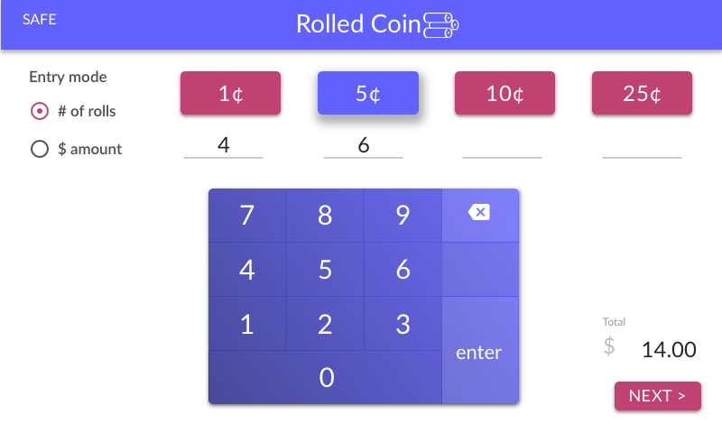
Auto-tab and auto-calculate to make the entry tasks fast. Key entry on the competitor's machines required many key touches. I innovated a keypad with auto-tabbing and auto-calculating of the dollar value in a coin roll. Using my keypad, users were able to reduce the number of interactions by 30 -50%.

keypad

Auto-tabbing / auto-calculating: 30% - 50%faster

Opportunity 3
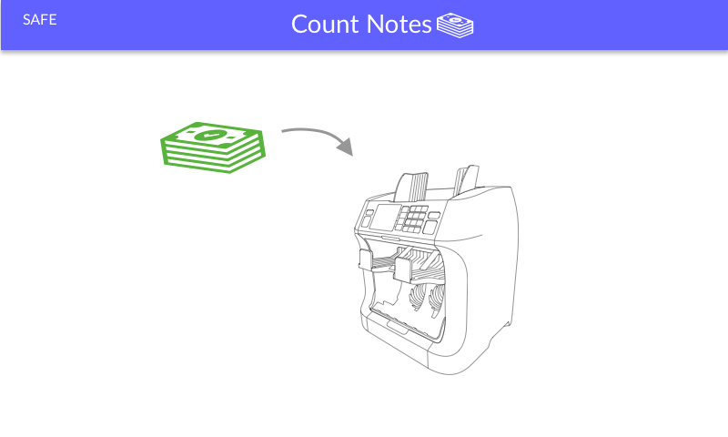
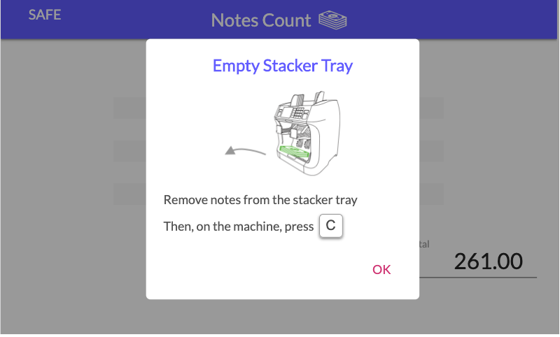
Guided steps in the UX would enhance proficiency. I had learned that the turnover was 150% in staff doing this job! Unlike the skilled worker we had shadowed, an inexperienced user would take up to 4 times longer to do this task. Perhaps, the biggest value add was enabling quicker training time,. This became a major selling-point

start count notes

Visual guide for the current step

empty staker tray

Prompt to empty the machine's tray

User Journey

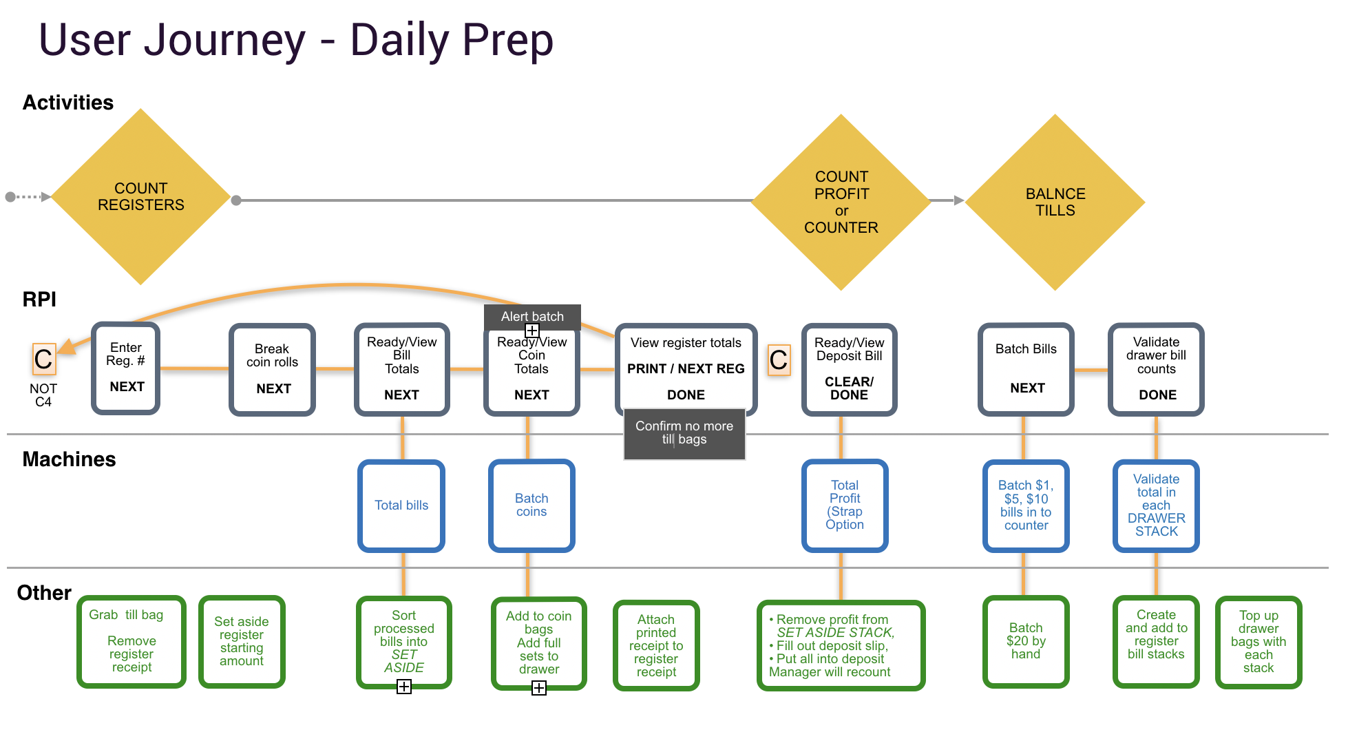
After stepping through the video to document the field study, I used it to create a User Journey, which I presented to entire team.

We confirmed the steps were accurate and complete. Dev was able to ask questions and understand the flow at a high-level in order to start building out the code for the expected inputs and outputs at each step.

Defining the user journey was a key activity in the definition phase. It brought together business value, persona goals, previewed the content and controls, and charted the course for information architecture and process flow. Especially critical to this kind of application, where many steps and branching in workflow is a central feature.

user journey

A segment of the user journey for Daily Prep

Interaction Design

I had the advantage of knowing exactly how the UI would be presented: as a wizard, on a 800 x 600 touch-screen, in landscape mode, in a windowless UI.

But being this specific also introduced limitations — with its own set of challenges.

  1. No scrolling, because swiping is inaccurate, requiring multiple interactions. Requires granular chunking of functionality
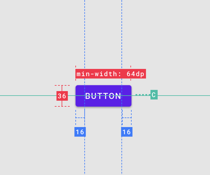
  2. Touch error, as the user can inadvertently trigger an interaction wherever the screen is touched. Requires careful attention to target size and margins.
  3. Loss of focus for the user in the process. Requires exacting information architecture.
    (Note that tax applications give you one question at a time — not distracting or fatiguing you with past and future steps.)

button

Target size and margins on touch devices

Design Workshop

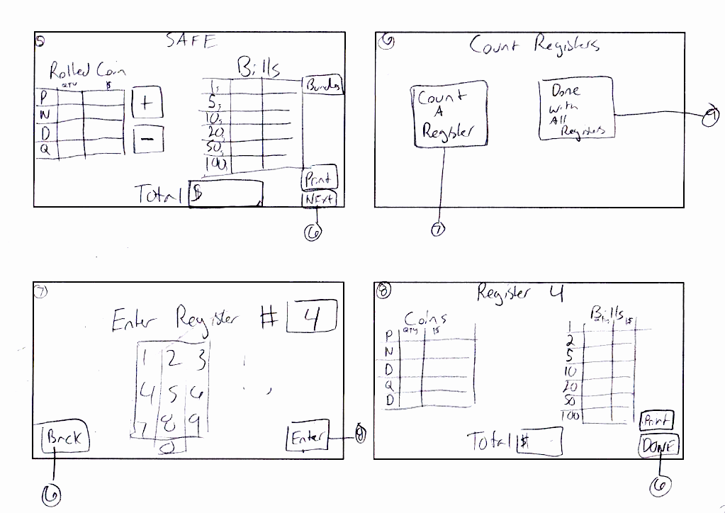
I met with the product owner, stakeholder and a sales manager to develop concepts for a few basic screens and controls that we knew were needed: navigation, keypad entry, and tally tables.

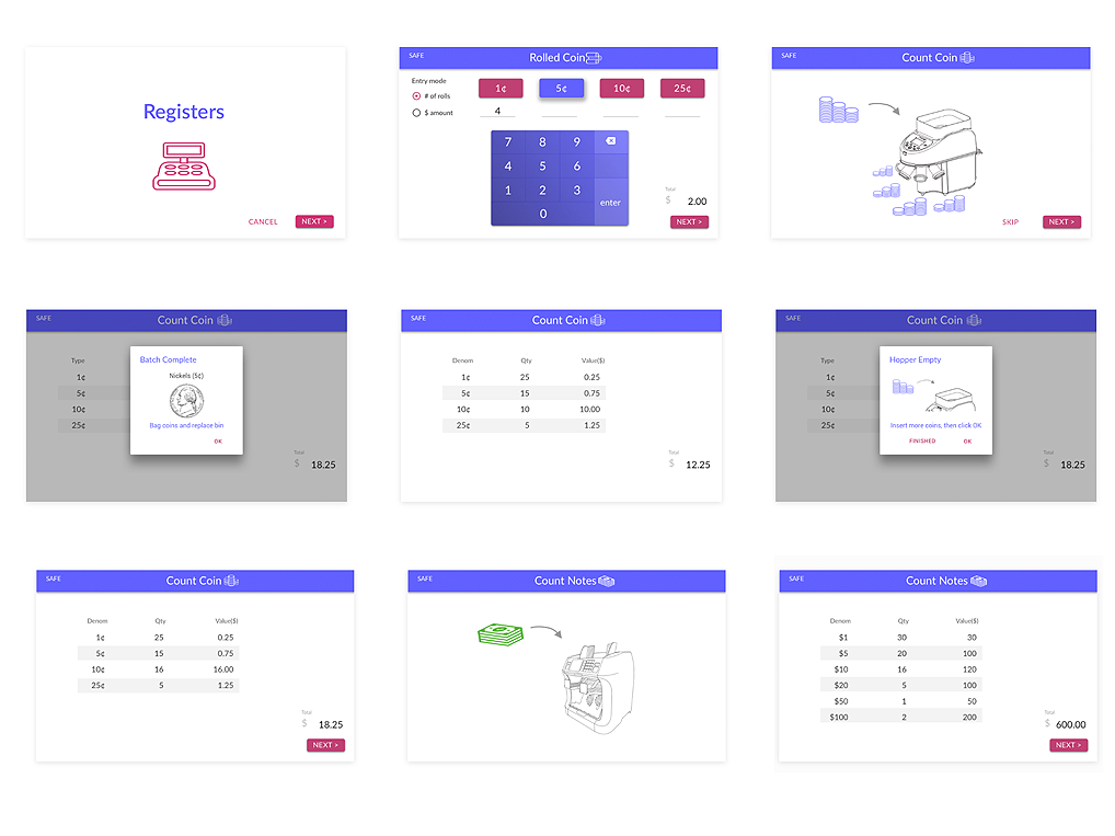
I then started designing high-resolution wireframes of all our screens with Material Design in Sketch. I chose a modern, bright color mood to add some delight in the UI.

Lessons Learned

A back button is a basic user affordance in web browsers and devices, but we had a windowless interface on a buttonless device. So, initially, I had included an on-screen back button.

I eventually abandoned the back button —
1) It turned out that going back in the flow would invalidate the ongoing count on the machine.
2) Users relied on the back button only when they had inadvertently selected the wrong task.

I was able to address both of these issues by affording a Cancel button at the beginning of a task, and a Done button at the end of a task, which would take the user back to the task options screen.

Never assume the need for anything by default — especially in unusual contexts.

concept sketches

Concept sketches for core screens

cassida-workflow

Hi-res taskflow

UI Development

With the designs completed, it was time to put on the UI hat guise of my UI/UX Designer job description.

Development stack

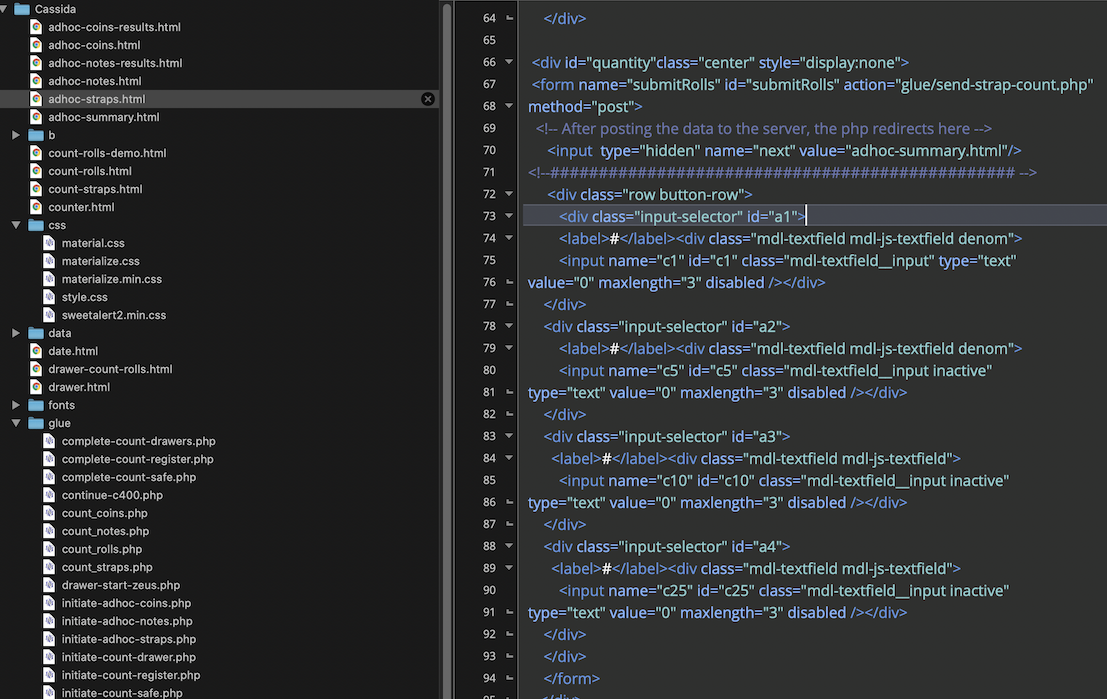
When I first learned that I would be doing the front-end coding, too, I worked with the Dev to find an environment where I could code with HTML/CSS/Javascript/PHP (Sorry, I don't know C++ or Python.) We also decided on a LAMP platform running a windowless Chromium browser on the Raspberry Pi.

code

Some code for one of the the app's screens

Design in Parallel with Hardware and Dev

The electrical engineer was a whiz. He got some bare leads from the machines feeding data to an ad hoc circuit board. This was enough for Dev to grab the format of the data for parsing into basic HTML on dummy screens.

Meanwhile, I was developing screens for the UI populated with dummy data stored in xml files and fed into the UI via PHP. This made it pretty straightforward for Dev to feed the data into those same xml files with dynamic values.

Lessons Learned

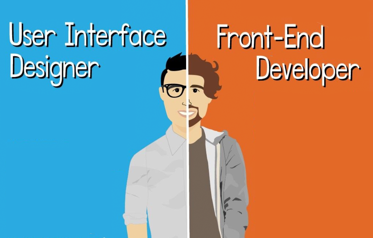
UX Designer and Front-end Developer are separate disciplines - how does that work in one person?

Over the course of my career, I have often been called on to do both design and development. Early on, I would go straight to code — after-all the design was in my head and didn’t need to be communicated to anyone else, right? Wrong!

I learned that as a one-man team, best practices is to split your personality as much you can. Put on your designer hat and work that through. Then come back and put on your dev hat. It is less stressful, and actually quicker, and the end result is better.

designer-coder

Designer and Coder?

Conclusion

The project was completed in 6 weeks, on-time, and installed in 2 of the client’s locations for a 3-month trial.

I did hear back that the UX was very well-received — though, they were plagued with hardware issues :(

Demo

Here is the live HTML prototype that I designed and developed.

Take Daily Prep for a spin

Next →