BMC Training Portal
Redesign

Displays
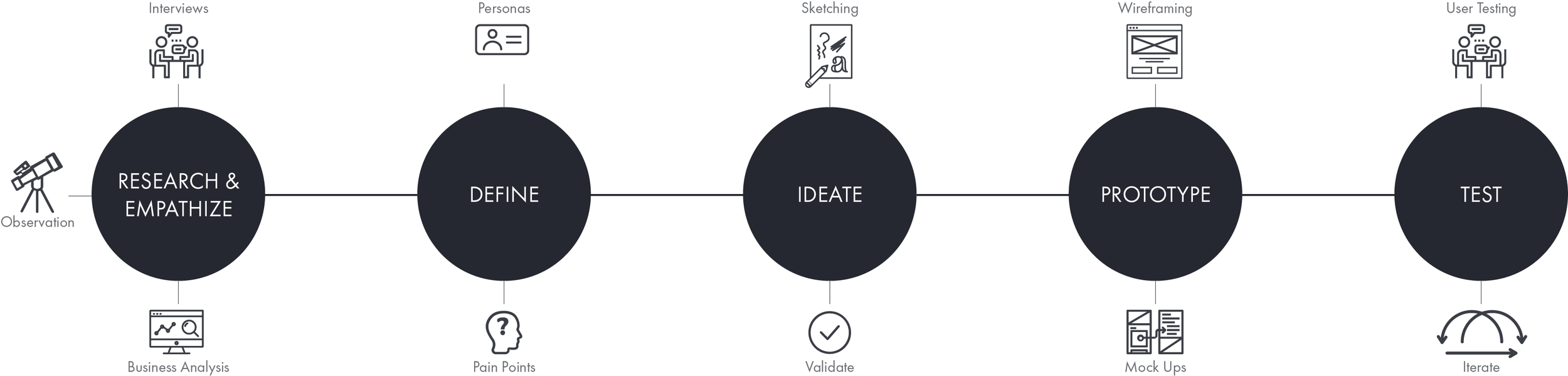
User research, metrics analysis, and usability testing in redesign of the training portal for a large IT software and services business.

Background

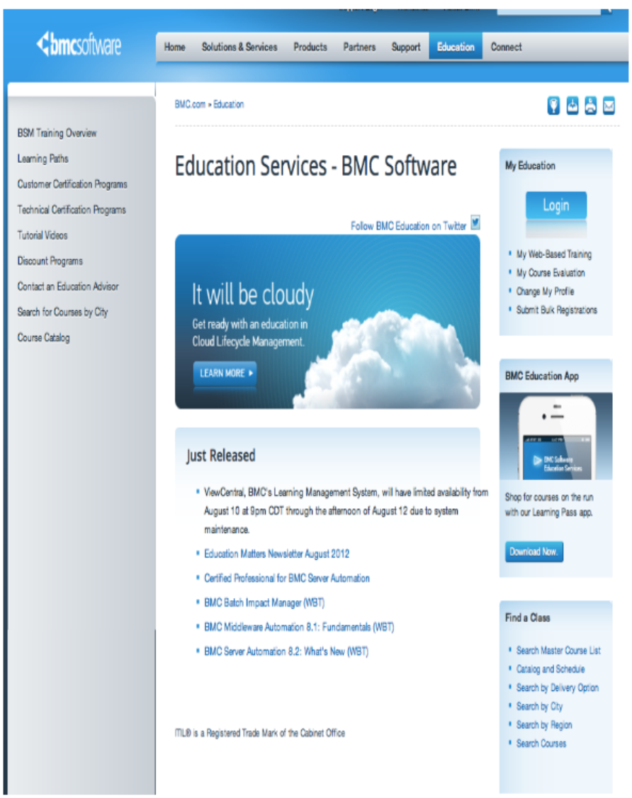
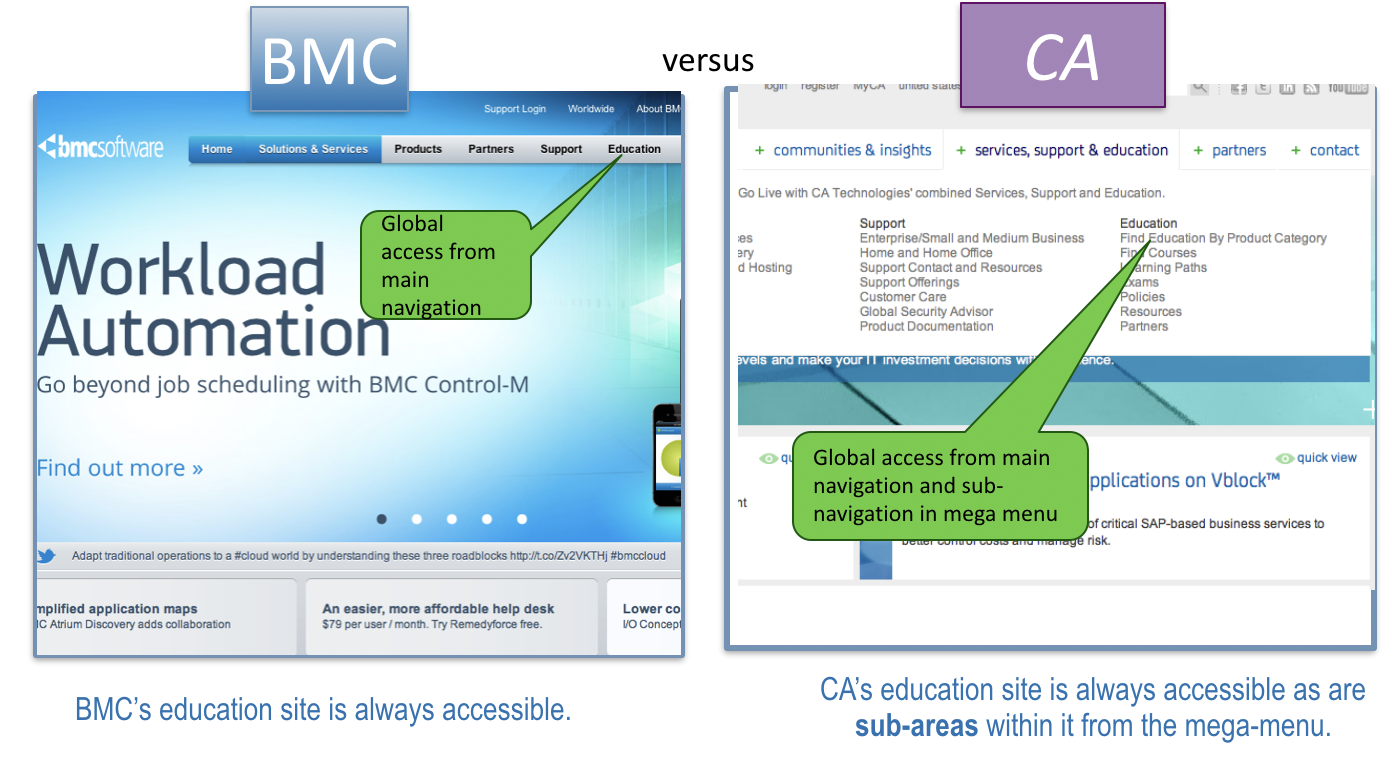
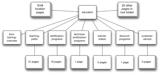
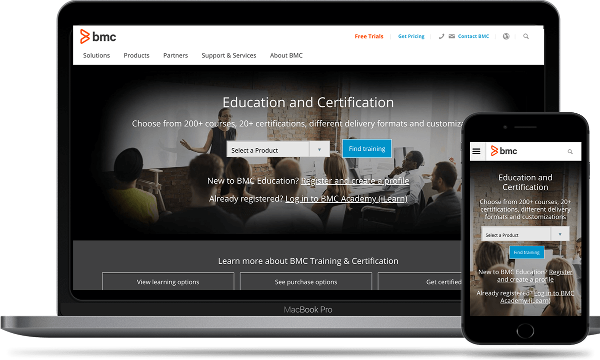
BMC is a leading supplier of software and services to IT departments. These are highly complex applications that require significant training to deploy and use effectively. I was tasked with analyzing the training portal to improve usability.

Business Driver

BMC Training wanted to identify UX improvements to the Education Portal that would help increase revenue from enrollment. Additional cost savings would come from reduced support calls and making FAQs and Terms and Conditions more prominent.

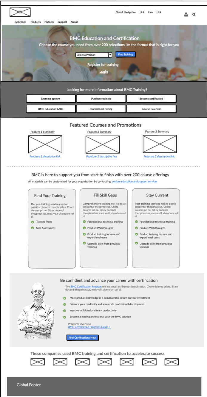
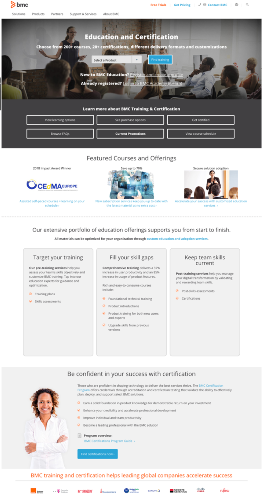
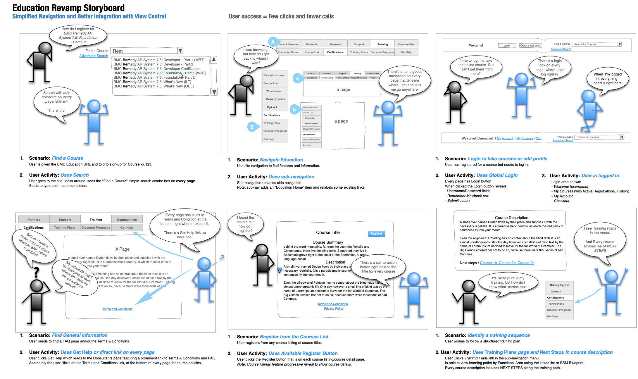
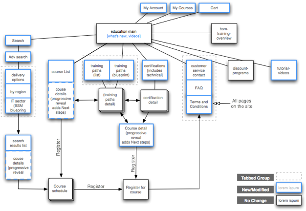
New interaction design will facilitate browsing, learning about, and registering for BMC course offerings.

itil-chart

IT software and services encompass dozens of products in every area of business.

Role
UX Strategist
Deliverables
Design Brief
Value Proposition
Storyboard
Competitive Evaluation
Content Inventory
Personas
Metrics Analysis (page flows, heat and click maps)
Usability Testing Report (before and after)
Site map (before and after)
Wireframes
Executive Presentation
Tools
Adobe CS
Balsamiq
OmniGraffle
MS Office

Challenge

I was tasked with enhancing the UX for the Training Main page, all of the templates for learning paths and certifications pages, and to provide an updated look and feel. There was a lot I needed to learn about the world of corporate support training.

New design will facilitate finding, learning about, and enrolling in BMC train offerings.

Solution

I delivered an updated design that facilitated users to easily find and register for any given course. The Customer Support tab, which offers course support information, was now attracting visitor clicks and decreasing support calls. Training Paths were now understood by users as place to add supplementary courses that build on the base courses they are taking. This helped customers to advance in their career goals while increasing revenue from training.

legacy home

Legacy portal page

mid-rez_main_page

Intermediate lo-res wireframe

new-home

New design

Approach

RB design methodology

design thinking methodology — with subtasks

Product Research

Value Proposition

The BMC education portal makes it easy to find, enroll in, and track needed training. Answers are always close at hand for any questions pertaining to the terms and logistics.

The value proposition of a project is the benefit the business offers to the consumer.

While at BMC, I created guidelines and template documents for the Value Proposition deliverable.

value prop

Value proposition template

value_prop-guide

Other guidelines I wrote for the UX Design team

Arriving at Training Value

I interviewed stakeholders to get answers to the question, "As a customer, why should I invest in BMC training?"

I collected these answers:

I want training because it —
  • Makes me better at my job and enhances my career
  • Adds value to my company’s investment in BMC software
  • Saves time and money
The training I most value is —
  • Specific to my job
  • Easy to access and use, with many options
  • Cost effective
  • The best trainings provide —
  • A clear path forward
  • A variety of learning modes
  • Is abreast of new developments in the software
  • Competitive Evaluation

    I compared BMC's Training Portal to 4 top competitors: HP, IBM, CA, and EMC.

    Findings
    BMC’s Education site compares well with competitors
    Pros
    - Links across BMC to the Education portal
    - Full-featured advanced search
    - Links to top features are prominent in the sidebar
    Cons
    - Search requires users to set up a database query
    - No faceted search by job role
    - Duplicate search features on the portal and LMS
    - Learning paths not promoted in the course description, and lack next steps

    versus CA

    Presence of links to Education compared with CA

    versus IBM

    Poor findability for both BMC and IBM

    competitive evaluation

    Competitive matrix shows room for improvement

    Analytics

    Together with SMEs, I determined the pages for the project that we wanted to improve and identified which of them I would run these metrics on — click maps, heat maps, and entrance/exit flow.

    feature list

    Pages identified for metrics analysis with Adobe Analytics

    Heat Maps

    I obtained heat maps from the site analytics program, Adobe Analytics, to discover where users are focusing attention. In this example, from the Education Landing page, the faces on the banner and customer service drew attention as expected. But in the center and right side, the links weren't being noticed.

    Lessons Learned

    At first, I thought this page needed more content at lower left. However, user testing, showed that it was a result of users scrolling the page down the left side until reaching the footer.

    Always coordinate quantitative with qualitative findings to confirm results.

    heat map

    Heat map for Education Main

    Click Maps

    The Adobe Analytics click maps for the Main page show where users actually clicked. Links in the left sidebar were being clicked. But, just as with the heat map, links in the center and lower right sidebar were rarely visited.

    An outlier was the customer service link. According to the heat map, it was drawing eyeballs. But it only received 1 click!

    click map left

    Left sidebar click map

    click-map_right

    Center and right sidebar click map

    Flow maps - Enter/Exit

    What do Education Main visitor do next? The flow map shows that 35% exited (), 10% went on to LearningPaths (), 6% went to support (), 40% logged into the LMS (not relevant).

    This result reinforced that Education users were not finding what they came here looking for. They were apparently being misled by something in the design.

    flowmap

    Flow map for Education Main

    User Research

    After learning what users were doing from quantitative analysis, I was ready to look into why they were doing it, using qualitative testing.

    Usability Testing — existing site

    I wrote and conducted a user test with 5 participants (self-identified as advanced web users working in IT). They answered some questions about their roles in IT, and then they attempted a few training specific tasks on BMC as well as competitor websites.

    Usability testing helped me identify many causes in the UX for why a customer would give up on using the site to find a course.
    • Key Findings
    • Most used functionality for locating a course was the Master Course list.
    • When looking for course support (how to cancel) users were generally unsuccessful, the two who succeeded did so after much trial and error
    • As expected, participants had an exceptionally hard time locating
    • When given a base course to start from. participants did not connect "Learning Paths" with a way to find advanced courses

    testers

    Demographics and IT experience of test participants

    Empathy Board

    Based on business goals and qualitative / quantitative testing. I made up a storyboard for stakeholders and developers to help build empathy with our users.

    It uses emotive figures to call out the issues I had identified, and depicts the proposed solutions.

    Storyboard

    Empathy board — a kind of storyboard depicting user experience

    Personas

    Based on the demographics of current enrollees in BMC training, I modified 2 of BMC's 6 base personas to use as primary personas for this project.

    IT Infrastructure Manager

    margret it manager

    BACKGROUND
    Margret is a 45 year old IT Infrastructure Manager at Swift Bank.

    Calls-to-action:
    Findability: easy to search and browse course lists, intuitive categorizations by IT area, and clear learning paths
    Support: easy access to training policies and customer support. Awareness: what’s new, what’s changed?

      GOALS
    • Quickly train her six direct reports on new ITSM software recently installed at her company.
    • Decide on, find, purchase, and track her staff’s training, which can be time consuming and confusing.
    • Get answers from BMC about training logistics and policies without needing to call.
      
PAIN POINTS
    • Managing the training needs of a diverse team - on top of her other duties.
    • Her team needs different levels of training: administrative training for herself, certifications for two staff, and the others who need end user training to create and run reports.
    • It isn’t always clear how to find help when her situation changes (i.e., cancelation and reschedules). She’d like to avoid voice mail queues and waiting for email takes too long.
      KEY CHARACTERISTICS
    • She needs to get multiple staff trained at different levels
    • She wants options (e.g. schedules, training platforms, levels of training, discounts).
    • Keywords: learn, manage, find, schedule, track, purchase, discounts.

    QUOTABLE QUOTES

    “I wish my staff was able to take charge of their own career paths, and self-service their own training.”
    “My company can't afford hiring someone just to manage the training of our employees.”

    IT Technical Staff

    harry

    BACKGROUND
    Harry is one of the technical staff in the IT department of Swift Bank. His job requires that he know and work with a variety of IT management programs at an intermediate level. His manager Margret would like to see him complete one training on their BMC software, each quarter.

    Calls-to-action:
    Findability: easy to search and browse course lists, intuitive categorizations by IT area, and clear learning paths
    Support: easy access to training policies and customer support
    Awareness: a clear (learning) path forward for courses with pre-requisites and next steps

      GOALS
    • Find, register for, track and complete personal software training
    • Advance my career by developing expert skills on my company’s IT systems
    • Training options and flexibility: I learn better at my own tempo and by seeing than when mostly listening and at an instructor’s pace.
      
PAIN POINTS
    • Told I need to take a training course. I was given the URL to the BMC training site, but I can’t find the training.
    • Unsure which one of these browse/search modes I am supposed to use?
    • I clicked a few links and now I can’t remember where I should go to login to the training?
      SCENARIOS
    • Interested in improving his skills with an eye to his career future.
    • Trying to progress from a beginning to an expert user using Learning paths, certifications, meeting Margret’s expectations.

    QUOTABLE QUOTES

    “It’s hard to get a big picture of what you’re running that night through the current UI.”
    “People make an adjustment… and they’re not aware of how wide-ranging that adjustment is… you have to go back and figure out where the adjustment originated.”

    Information Architecture

    To address the UX issues I had found, the first thing I did was to look at improving navigation and landing pages to better support business and user goals. I sketched out a site map for the new pages with a linking schema to optimize the following tasks.

    1. Find a Course
    Task: Given the BMC Education URL by their manager, users can sign-up for the required course.
    Task: Browse for course
    Task: Search for course
    2. Register from the Courses List
    Task: Users can register from any course listing of course titles
    3. Navigate Education
    Task: Use site navigation to find features and information in the Education section.
    4. Login to take courses or edit profile
    Task: User has registered for a course but needs to enter user name and password.
    5. Find General Information
    Task: Find the FAQ page
    Task: Find the Terms & Conditions
    6. Identify a training sequence
    Task: Find a structured/sequenced training plan/learning path
    Task: Explore course within a training plan

    sitemap-previous

    The existing IA was a flat hierarchy with little inter-linking

    sitemap new

    The new IA featured prominent access throughout the site to login, registering, training paths, and important information.

    Interaction Design

    With the training portal structure revised, I produced middle resolution wireframes for the Main page and all the new pages (templates). I also made up a second set of wireframes, adding enough detail to use as prototypes another round of user testing.

    These were the top changes in the new design:

    • Highlighted priority links on the Main page (i.e., Find A Product, Learning Options, FAQs, Certifications)
    • The layout of the Main page now called attention to important training features (i.e., value prop for follow-up courses, value prop for training paths, promotions)
    • Ubiquitous contact button, Contact an Education Advisor, on every instance of a course description throughout the site.
    • There was a clear call to register, Pricing and Registration, on every instance of a course description throughout the site.

    mid-rez_main_page

    Annotated middle resolution wireframes (minimally interactive)
    Scroll image to view full page

    Usability Testing — new site

    I wrote and conducted a follow-up user test on the new design. Again, I recruited 5 participants (self-identified as advanced web users working in IT). They were asked to attempt the same training specific tasks as were tested on the existing site.

    This 2nd test with the new design validated that we had addressed the majority of UX issues in the existing training site.
    • Key Findings
    • Users completed tasks in a short amount of time with few clicks
    • Users easily browsed for a given course using the Courses tab in sub-navigation and the Course List link in the Find a Course box on the Main page
    • The Customer Support tab was universally noticed and used to find course support information within 1 or 2 clicks
    • Participants related well to the new term "Training Paths" when asked to find other courses that would build on the base course they were assigned

    testers2

    Demographics and IT experience of test participants

    Conclusion

    This Use Case study focused on the user research, metrics analysis, and usability testing of the training portal of a large IT software and services business.

    Lessons Learned

    I improved my knowledge and use of our team's UX process. In fact, I put into practice most of the process guidelines I, myself, had written up for each step of the process. I also delivered my work product using the templates that I had created for our team.

    Additionally, without the invaluable input and support I received from SMEs — who made themselves readily available — I wouldn't have been able to as accurately and efficiently produce the new design.

    It was great balance between working together as a team, and being able to work independently — working without supervision was an important quality as I was working remote.

    value_prop-guide

    Set of guidelines I wrote for the UX Design team

    Next →